BRANDING
DE SIGN
BRAN
DING
DESIGN
Prohibition, a counter-culture presence in Montreal, Quebec, evolved from humble beginnings to become a respected purveyor of smoking accessories and stylish apparel.
The previous visual identity lacked a distinctive visual language. The use of generic forms and typography didn’t capture the brand’s spirit or create strong visual recognition. Without a clear graphic system, the old identity struggled to communicate the bold attitude and cultural relevance that define Prohibition.
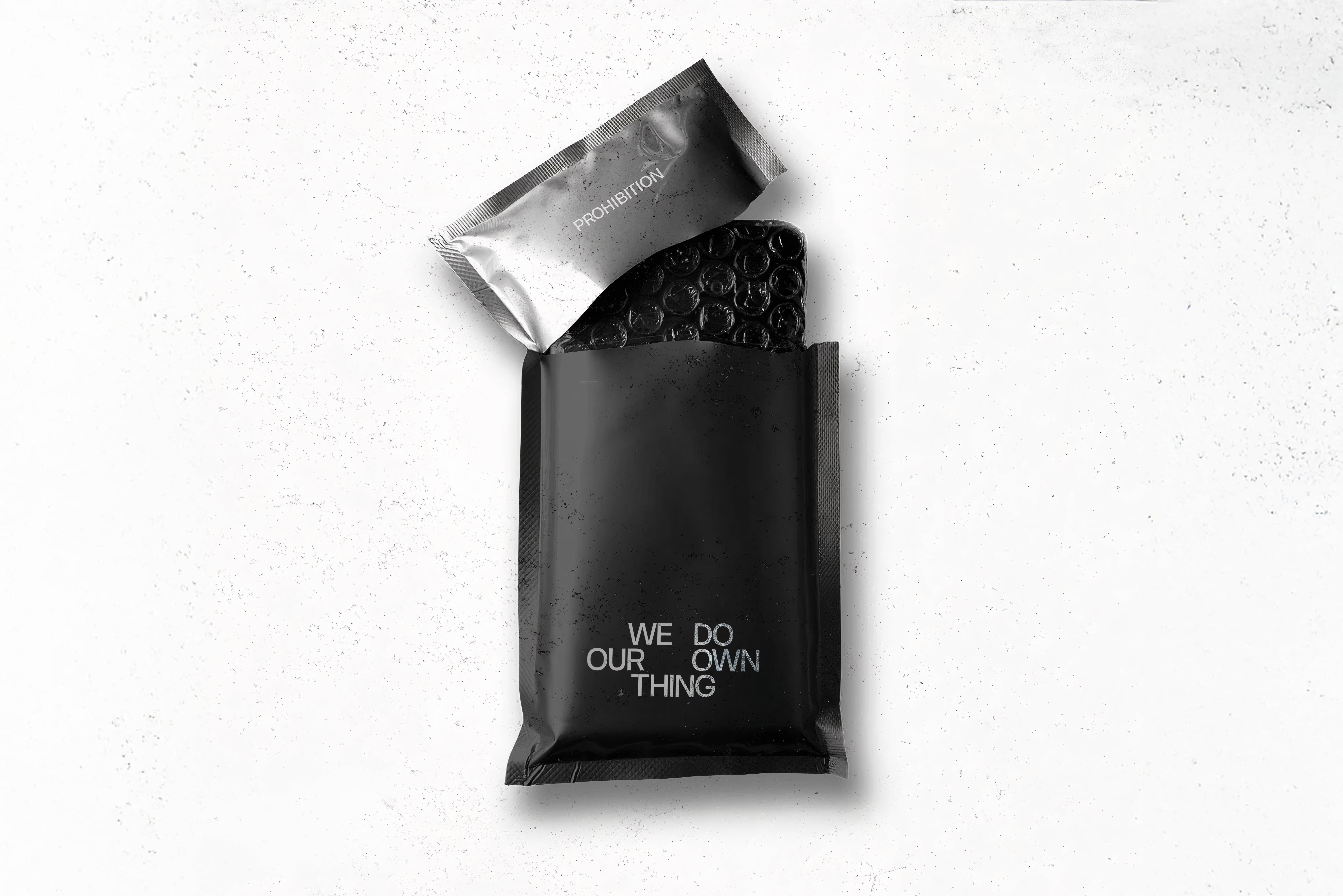
The rebrand introduces a sharp and refined design system built around minimalism and structure. A custom logo mark, distinctive colour palette, and a flexible grid come together to translate the brand’s energy into a clear and recognizable visual language. This new identity is applied consistently across apparel, packaging, and branded materials, generating Prohibition’s connection with its community.

%2012.36.45.avif)


.gif)